Identity Development
The Therapy Store
“Rebranding” doesn’t quite do justice to the transformation this business undertook when our client purchased it; perhaps “rebirth” is more apt.
The Client
The Therapy Store, established 2015, is a physically-browsable warehouse and online e-store specialising in toys, learning tools and accessories with a therapeutic benefit for children with learning delays and various levels of ability.
The Brief
A name change was part of a complete branding overhaul, and we helped the client with the selection of a name before designing the new visual identity.
Seeking to retain the existing customer base as well as appeal to a broader audience, the brief was essentially to present the business as child-friendly, but understanding parents, carers, teachers and treaters were the clients.
Development
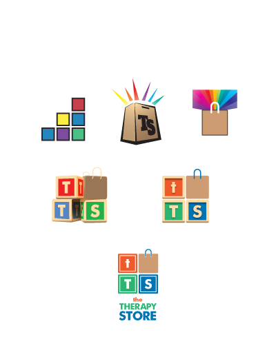
We explored various concepts seeking to convey a progression, or development, while also incorporating a shopping element; the analogy of stacked building blocks was favoured fairly early on, and though we explored other visual cues, we kept coming back to the simple coloured square.
Various representations of the blocks were investigated including 3D and skeumorphic versions; we decided that the simpler coloured blocks conveyed all that was needed, and left options for integration.
“Almost weekly I’m complemented on the new identity, and I think it still looks fresh, distinctive and clear.”
The brand has been put to use on stationery, the website, a huge taut banner for trade shows, e-newsletter campaigns, advertising, packaging, and signage.


